Thanks to mobile devices, responsive website design is becoming standard practice at web design agencies. For efficiency purposes, the goal is to design once and make it look great on all platforms, browsers, screen sizes and mobile device resolutions. Some designs really hit the mark with cool, innovative and stylish responsive sites. Among them are these 10 responsive websites that prove that creativity doesn’t have to be compromised for functionality in a responsive design.
1. BBC News
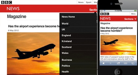
What stands out about the BBC is its ability to make a responsive news site without compromising its reputation for big, stunning photos. The BBC News responsive design is perhaps the best of the lot because it scales perfectly and quickly to different devices. The visual design is exquisite and the layout keeps in line with the familiar look of the BBC News desktop website.
View site
2. Contents Magazine
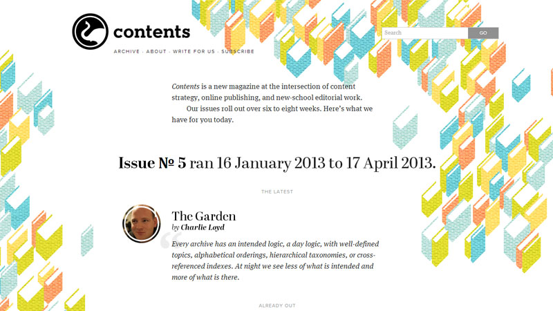
Contents magazine has managed to make a responsive website that goes above and beyond visual appeal expectations. The design is eye-catching, the typography beautiful, overall design and layout inviting, and navigation a breeze. What’s innovative about this responsive site is the way the illustrations for each article wrap around the text using various techniques to accommodate breaks in the content. The goal for the mobile friendly site was to keep the issue content front and center, and it was achieved with balance. It is the perfect example of a print magazine making a seamless transition to online, all the while making it reader-friendly for mobile devices.
View site
3. Microsoft
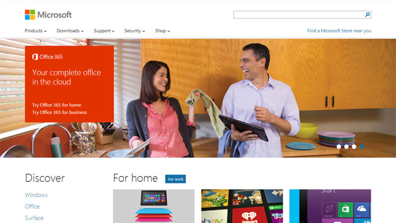 You would expect a technology giant like Microsoft to be ahead of the responsive design curve, but its new site exceeds all expectations. Microsoft has done some real innovative things here, with drop-down menus behind click or touch events rather than :hover, good use of white space and a real hip style presentation. What’s more, the designer found a way to successfully deal with a lot of navigation while keeping the layout and design simple and uncluttered.
View site
4. Skinny Ties
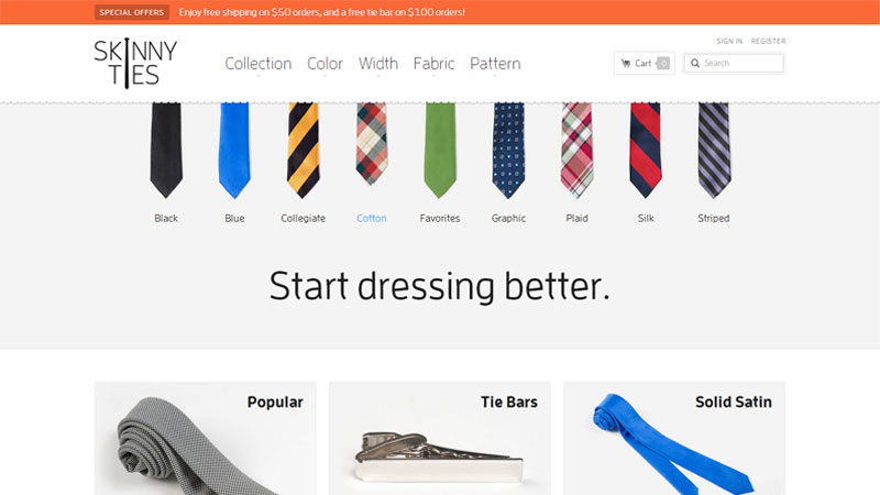
This is perhaps one of the most attractive e-commerce sites, no matter what device it’s viewed on. A simplistic design in color blocking style coupled with concise product information and a perfect selection of solid and patterned product images prove that responsive techniques can be used for more complex sites like e-commerce. Web design agencies know that visual is key to e-commerce and Skinny Ties raised the bar high with its usable design across all viewing resolutions. It loads quickly, the search options are plentiful and the navigation couldn’t be more functional, despite the use of :hover. This site could be used as a case study in how retailers should create a responsive website.
View site
5. Time Magazine

Print and online news magazines and newspapers are quickly discovering the importance of responsive websites since much of their readership access their sites on mobile devices. Time magazine is tops among responsive news sites with its prominent images, headline and content readability, and scaling options that accommodate any size mobile device. The website designer accomplished the transition to mobile without losing Time’s identity. It’s a really good unified site that gives all Time readers, no matter how they’re accessing the magazine, the same experience.
View site
6. Polygon
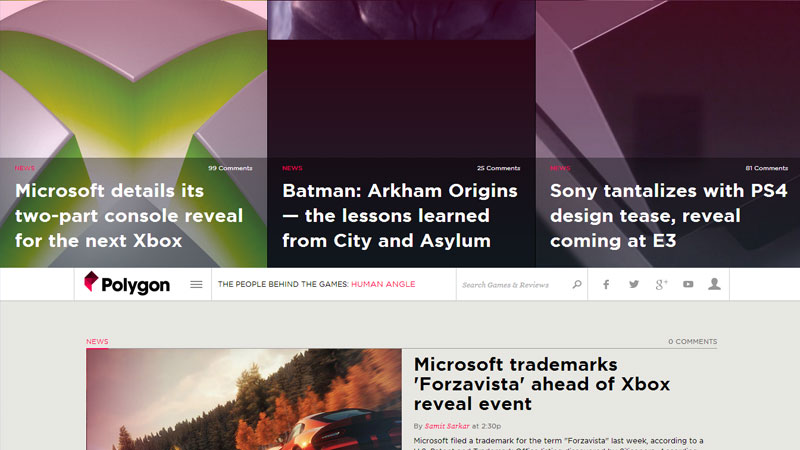
With any gaming site, creating a responsive website challenges web design agencies to maintain the richness of big graphics on different size platforms. Polygon is one of those gaming websites that hit a grand slam. Big graphics, yes, indeed. Responsive architecture, you bet. Ease of navigation, count on it. Polygon’s gaming features are amazing across the board and the site is a model that other major gaming sites should follow.
View site
7. University of Notre Dame

Traditional academia sites tend to lean more towards text and less towards graphics. But as web design agencies know, that combination doesn’t translate to mobile. The University of Notre Dame gets high marks for its user-customized responsive design website that emphasizes big graphics. Take a look at some of the cool responsive techniques the Fighting Irish incorporated into its site: Geolocation for its Campus Tour feature that shows which locations are close to where you are on campus; server side technologies to lighten the page elements for small screen devices and well-placed branding elements. Plus, the university maintained its clean and classic look while turning its traditional site into a smart, responsive one.
View site
8. AIDS.gov
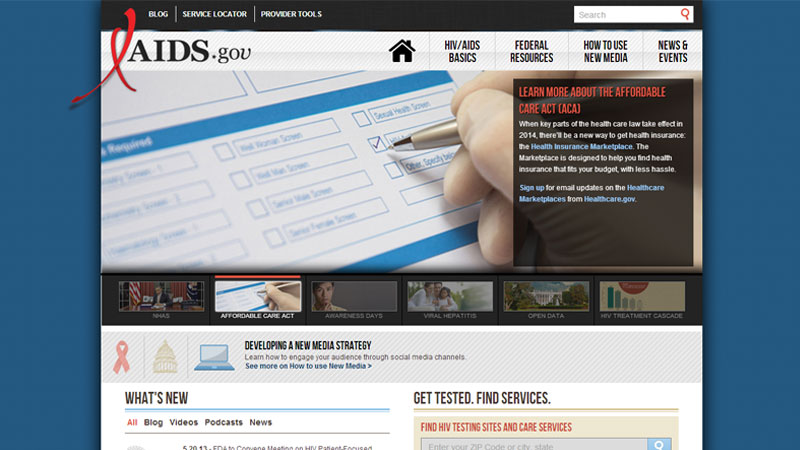
It’s good to see the U.S. government on top of responsive web design with its AIDS.gov campaign. A strong message that promotes awareness needs a strong web design and the website designer did not shy away from the task. The goal was to make HIV information accessible to all on any device and it is successfully achieved with techniques that allow site information to be reused across social media platforms. The crisp navigation nicely complements presidential images and provides easy access to an array of HIV information and resources.
View site
9. United Pixelworkers
It’s color blocking at its best on the responsive website of United Pixelworkers. The website designers for this e-commerce site relied on a grid layout that nicely scrolls on any device. Responsive e-commerce is always difficult, but the bold color text blocks nicely balanced with product blocks is a smart design technique for simplifying navigation and providing a positive shopping experience. There is good usage of large typography, nicely arranged menu buttons and drop-down bar navigation, and a well positioned shopping cart. From the home page to the product pages, United Pixelworkers shows how to make a fun, inviting and responsive e-store.
View site
10. Starbucks
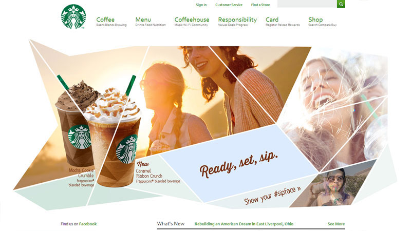
The king of coffee is the king of responsive website design, too. The site is fluid, functional and consistent with the Starbucks brand. Although the site is rich in content, design techniques make it easy to view and read from any device. It’s clear the Starbucks web designers took a think-out-of-the-box (or should we say coffee cup!) approach when it came to marrying big, detailed images with content and navigation. The web designers certainly earned their grande latte!
View site
With responsive design, there’s no cookie-cutter approach. Web design agencies respond first to the diverse needs of their clients and then formulate a design that is innovative in functionality, yet in line with the client’s established branding or business strategies.
There’s no mistaken that technology has dictated the need for web designers to invest in responsive website design in order to best serve their clients and remain competitive.