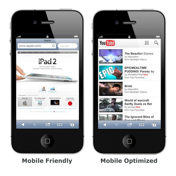
With web enabled mobile devices becoming more and more popular, it’s important to have website that maximizes the mobile platform. However, it’s not enough to just use your existing site and let it be shrunk to fit the device. Here is a quick list of some of the most common issues to consider when developing the mobile version of your website.

1. Do not limit yourself to just trying to imitate your primary website
It’s not realistic to think you can just take a smaller version of you existing website, move a few things around, shrink some of the graphics and think it will look ok. In most cases it will not. Usually people are using their phones to view your website when they are on the go. When that’s the case, they will be on a much smaller screen and your site will need to be optimized for that screen size.
Some examples of the smaller screen sizes include:
- iPhone 5 is 640 x 1136
- iphone 4/4S is 640 x 960
- HTC One X is 720 x 1280
- HTC Amaze 4G is 540 x 960
- Galaxy S3 is 720 x 1280
This is obviously not the screen sizes you get on computers, so you mobile website needs to be optimized for the smaller screen resolutions. While it’s not practical to try to fit every possible screen size, it’s highly recommended that you consider something in the middle of the smaller sizes.
2. Consider the touch screen interface
Most of the time your visitors will be using a mobile device with a touch screen for navigation instead of a mouse or buttons. A safe rule of thumb is to consider a one-centimeter square for the touch target, but larger is always better for touch target. Consider making the target area larger than the button image so that inaccurate touches can still activate the button. Also, consider that fingers and thumbs are not precise, so the action of the button should only be engage after the finger is lifted off of the touch target. When using gestures to help navigate your mobile site, keep in mind that not all gestures are as well known as other. Keep it simple, so your visitor can concentrate on your content without getting frustrated over navigation.
3. Mobile navigation
Since the screen is considerably smaller the navigation is smaller too. So consider offering a back button for previous pages. This can be especially helpful when your visitor makes a mistake and hits the wrong button when moving around your site.
4. Test, test and retest
One area where many designers fall short is properly testing the site on multiple devices after they have completed it. It’s very important to make sure your mobile site is accomplishing all the goals you need it to. Get feedback and input from outside sources to ensure that you have the usability in the finished product that you intended to have. If it’s not feasible for you to have a firm test out your design then utilize friends and family to put your mobile site through the paces. Then use their feedback to adjust your site and get it as user friendly as your primary website.